I’m going to take you through the process of a graphic novel in a series of posts. This is from my perspective, as a writer and artist who makes fantasy books for middle grade and young adult readers - but hopefully it will be helpful even if you’re interested in making a different kind of book!
Today I’m going to talk about how to start the process of drawing a graphic novel by building a page template; it’s going to be a pretty technical post!
A note on programs: For graphic novels, I draw on Photoshop (CS6) on a Mac, and use a Cintiq. I know a growing number of people are using Clip Studio Paint to draw comics, as it has more comic-specific features.
I’ve also drawn smaller comics on my iPad, using Procreate.
Page Template
You’ll want to build a page spread template that you can duplicate for every new spread. Draw a simple guide so you can easily duplicate that first file and draw your page on top of it.
Exact dimensions vary depending on publisher and demographic. If you’re working with a publisher, ask them in advance for page specs. If you’re starting work with the intent to eventually pitch, here are some common dimensions for the trim area of your books:
Graphic novels can be 6.5 x 8.5 inches, 5.5 x 8.25 inches, 5.75 x 8.25 inches, 6 x 8.5 inches, or larger. Classic floppy comic books are 6.625 by 10.25 inches.
Trim area: where the page will literally be trimmed. Marked with the black line in the diagram. Everything important MUST be within this area. The common dimensions I mentioned above refer to the trim area; you can extrapolate the bleed and live area from that number.
Live area: where you will draw the panels. Marked with the dark green line and area in the diagram. Usually 0.5 inches within the trim area. The edge of the live area will be the outer edges of your panels, unless you’re breaking panel borders with a lineless panel or a bleed panel.
Bleed area: 1/8th inch (or 0.125 inches) on every side of the book that will be trimmed. Marked with the red line and area in the diagram. This is here because printing and trimming can have slight variations—if you want your art to extend off the page, it will need to fill the bleed. DO NOT include anything important in the bleed, as it will most likely be cut off.
Interior trim size: the space between the left and right page, usually 1.25 inches, or 0.625 on either side of the center crease. Marked with the purple area on the diagram. Because of the way a bound book works, you’ll need to give your art extra space around the crease. If you’re doing a big page spread, never put important art or text in the central crease because it will be lost! (Example below!)
Resolution
When you build your page template, the DPI (dots per inch), or resolution, should be AT LEAST 350. This ensures that your art will not be pixelated or blurry when it prints. I usually draw my books at 450 DPI, because that lets me take smaller drawings and enlarge them, without pixelation.
This will make your pages look huge if you zoom into them 100%! We do this because print has a higher resolution than computers. An image that looks sharp on a website only has to be 72 DPI—but when you print, it will be blurry.
Color Mode
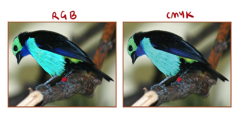
CMYK Color (which stands for Cyan, Magenta, Yellow, Key/Black) is a setting that you should always turn on in whichever program you’re drawing in. This will ensure the program only shows you colors that can print accurately.
RGB Color is the standard setting that we view images online with (it stands for Red, Green, Blue, although in my head it’s always Ruth Gader Binsburg). Images on a screen are made of light, so you can achieve much brighter colors. Images in a book are made out of ink printed on paper. The different processes mean RGB has a greater range of colors.
When coloring books, I’ve found that colors on my screen always come out a bit darker when they print. It’s also harder to achieve certain effects, such as neon colors. CMYK is also weak at showing light greens, teals, blues, and yellows.
This is something that will be more important to discuss when we get into coloring comics; but even if you’re making a book that is only black, white, and grey tones, remember that your grey tones will come out darker than they appear on the screen.
Layers
File organization can be really hard to do, and I’ll admit that I usually just do whatever is easiest in the moment and then organize my layers once it’s time to submit my files! But…if you’re an organized person, here’s the format publishers like to receive art in.
Isolate all the text in its own group of layers. It shouldn’t be merged to any pieces of art.
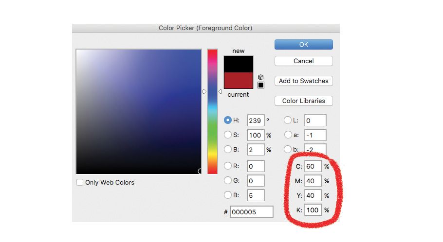
One reason for this is that if your book is translated into another language, they can easily access the text-only file. Another reason is that book printing uses something called rich black. It’s a mixture of colors in the CMYK spectrum that make the darkest possible black, and it’s a way to get very clear text. Anything in the text group will be printed in rich black, so keep that in mind if you want to have a piece of text that’s colored.
Here’s how to get rich black on Photoshop; your publisher might have a specific blend of colors they’d prefer, so it’s worth asking. And with all of this nitty-gritty advice, it’s worth asking the art director at your publisher about this stuff! I’m only speaking from my own experience and every publisher has their own preferences.
The other layer group should have all the art.
All speech bubbles should be on a layer separate from the art. Lineart should also be kept separate from the art; sometimes a publisher will want to print the lineart using rich black as well. If you have mostly black lines, with a few colored lines, put them on separate layers. Panel borders should be in a separate subgroup for this reason as well.
Note: Make sure to draw behind the speech bubbles! It seems unnecessary—the art’s getting covered, right? But again, if the book is translated, the shape of the speech bubbles will change, and you don’t want there to be a blank spot behind it.
At this point, you have your page template set up and ready to go! It should look something like this.
Brushes
At this stage you can choose a few more things. What brushes will you be using? I use a specific Kyle T. Webster brush, Mr. Natural, which I believe is available only through Adobe CC. I’ve used it to draw all my graphic novels, from thumbnails to final. One of the things I love about it is that I rarely have to adjust the brush size; it responds well to pen pressure and can easily give me thick or thin lines.
There are so many great brush packs available online. Play around with brushes, but keep in mind that simpler = better! If you find one that works for your entire book, that will make everything easier.
Using the Template
Now that you have your page template, you can paste your thumbnail directly into the template and resize it.
Here is when I draw my panel borders. I draw the speech bubbles (in a random color so they don’t get lost in the white background) and text at this point as well, so the art leaves room for them.
Lettering is an art in itself. I use a font that my publisher made from my handwriting; before that, I used open-source fonts that matched my line quality. For shorter comics, I will hand-letter, but that is really strenuous for a full graphic novel. Some comics will bring in professional letterers to hand-letter the whole book or to arrange the text and draw the special sound effect text. It really comes down to personal preference!
Don’t pack your speech bubbles! I rarely have more than one sentence in a speech bubble, and sometimes even break up a sentence into several bubbles. This lets the conversation flow and gives it a sense of pacing, rather than hitting the reader with all the text at once.
Your goal is for the text and speech bubbles to feel like a part of the art, not like they were pasted on at the last minute. Play with their size, their shape, their placement. I like to keep my bubbles lineless because (1) it’s easier to adjust size, and (2) I like how they look on the page—they don’t distract from the line-heavy art, and their being lineless indicates that they’re not a physical object in the scene. This is, again, a matter of personal preference!
Once you’re at this point, you’re ready to sit down and start drawing your pages! This was a very technical post, so next week I’ll talk about the more ~emotional~ side of doing a long project: how to stay motivated, organized, and excited about your work.


Hi Molly! I'm so glad I found you on Substack. This post is incredibly helpful; there's a lot of confusing information online about sizing for comics, and this is very clear, so thank you for that! I have a Substack and I want to start putting my graphic novellas there. Can you share any info about sizing for Substack? I'm working with Procreate. If you've already covered this topic elsewhere, my apologies, and would you be able to post a link? Many thanks! Excited to read your comics!
Hi Molly! Thank you so much for sharing all these resources, no less sharing for free. It's really amazing. If you get a chance, I'm just wondering if you'd have any advice re: programs. For a short (self-published) piece, I got by with just learning some basics in Gimp and InDesign (I drew/wrote everything by hand, scanned, and used those programs for touch-up and layout). I'm building up to making a full-length book, though, and have been thinking I may need to learn to draw digitally and invest in new tools -but- I'm having trouble deciding which route to take. Do you recommend Photoshop, Procreate? Getting an iPad, Cintiq? I get the sense these may be worth the expense, but not sure... At the moment, I have no digital drawing tools or experience in this realm! Any advice would be very much appreciated :)