I’m going to take you through the process of a graphic novel in a series of posts. This is from my perspective, as a writer and artist who makes fantasy books for middle grade and young adult readers - but hopefully it will be helpful even if you’re interested in making a different kind of book!
Thumbnailing is an arduous but vital process. You’re taking the script—a thing made of words—and beginning the transformation into a story told in visuals.
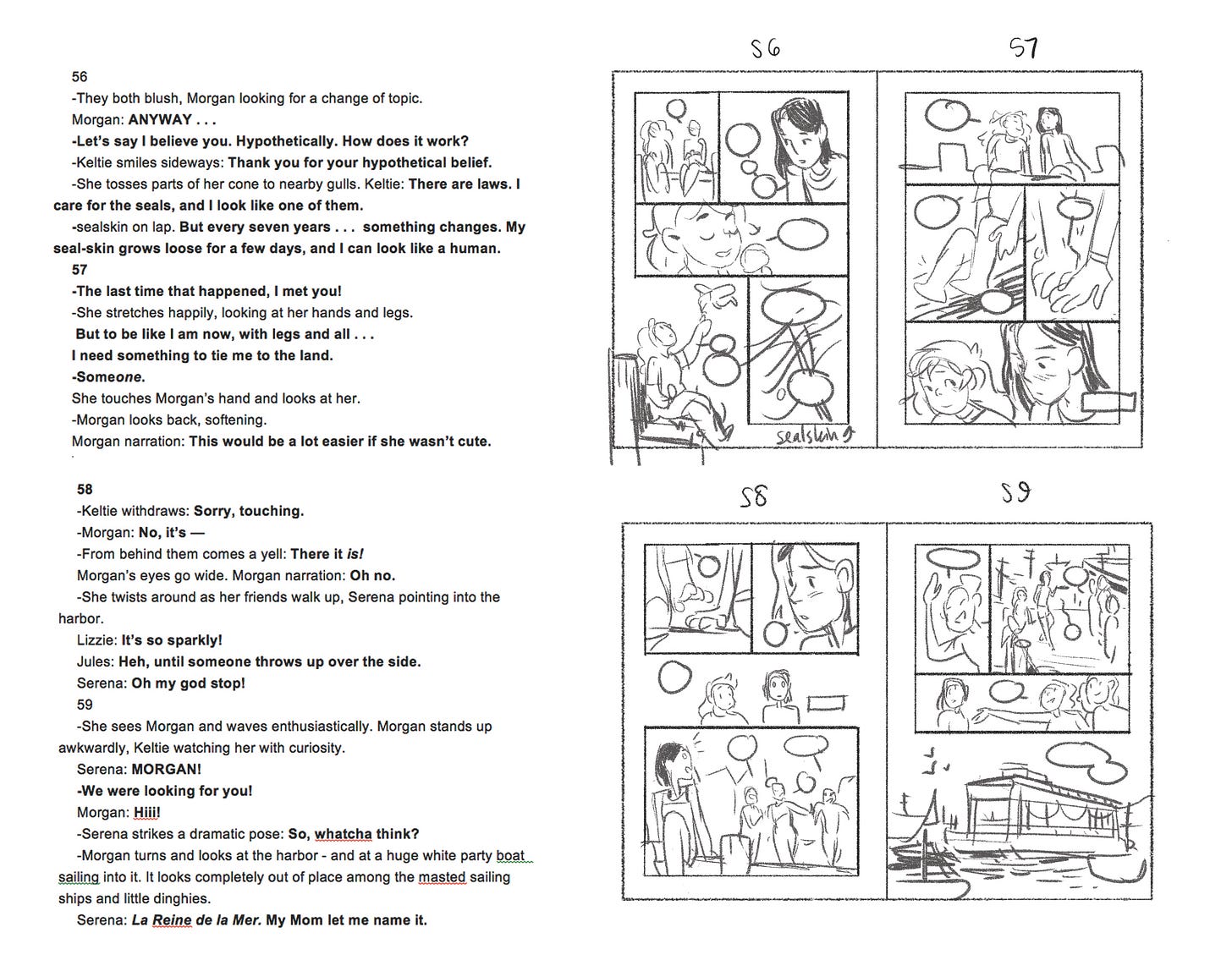
Here’s what my thumbnails and my working script look like. Hyphens designate individual panels, and bold text designates dialogue. This is the format that makes the most sense to me, and the publishers I’ve worked with haven’t seemed to have any problems reading it.
I’m prioritizing the page layout over the actual, individual panel art. Figures are extremely simple, just a way to work out rough overall composition. Make sure to note where the text will go as well—that’s a part of the page composition! Your reader’s eye will always go to faces and text first, and will follow a character’s gaze—that is how our brains work! Think about how that will move a reader around the page.
Example of page flow using text and faces to move the reader around (using finished art so it’s clearer):
It can be tempting to start drawing your book without thumbnailing the whole thing out. I always go a little crazy during thumbnails because I’m doing so much mental work but it just looks like scribbles! It can be frustrating. BUT, I really recommend doing this work up top. You will have a stronger idea of the structure and pacing of your book, and how long it will be, if you’ve laid it all out.
Page Spreads
A page spread refers to the pages that lie side-by-side when you open a book. If you’re making a graphic novel for print, this is the world you’re living in; it’s the format to which you will fit your story. I encourage you to draw your thumbnails as spreads rather than individual pages. The reader will be opening the book and seeing all the art at once, so you need to make sure it works together. (Of course, online comics are a whole other story and allow you to break this format in exciting ways! This is specifically about comics that will be printed in books.)
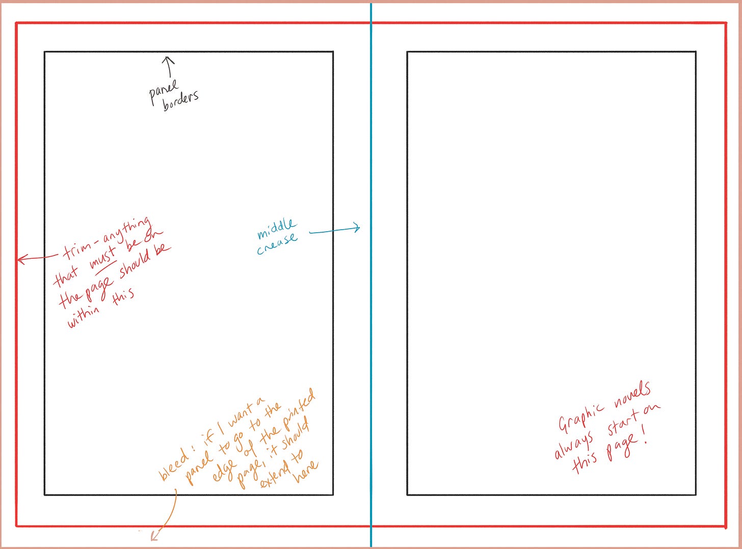
Here’s a sample page spread. Exact dimensions and size will vary depending on your publisher (for example, middle grade and YA are usually different sizes). Some of the things listed below—trim line, bleed—will be more relevant as you begin pencilling and inking, but it’s good to consider them as you’re thumbnailing.
The First Page
Like many things, the first few pages are the hardest, so here’s some information to ground you:
It is industry standard to begin on the right hand page. This is because (1) they’ll put publishing info on the left hand page. But also, (2) you don’t want to overwhelm your reader with information they don’t have context for. A full page spread of panels for a story you don’t yet know about is daunting; a single page is more enticing. You want to lure your reader into the story, to make it easy to turn the page.
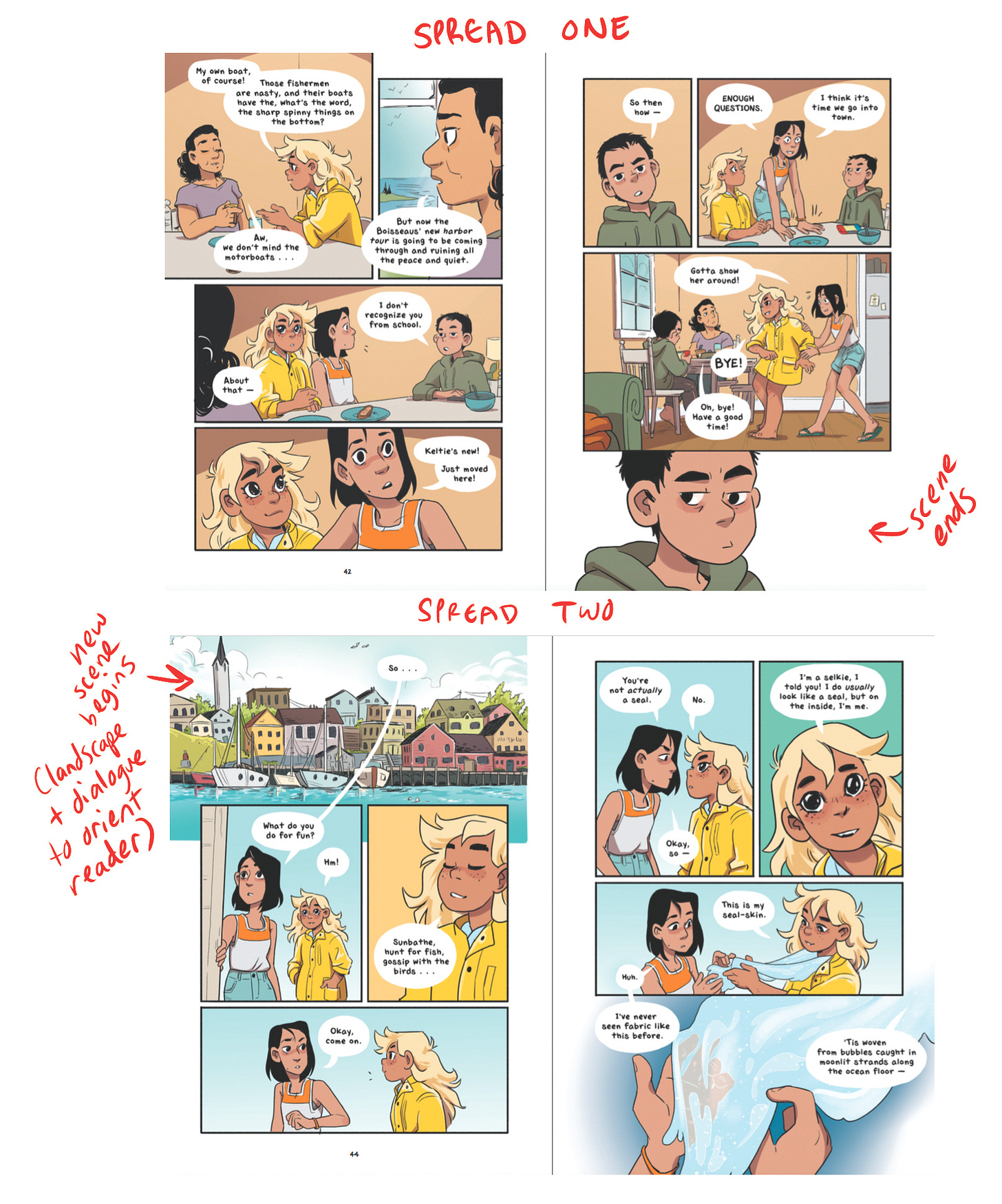
I often start with a big landscape shot, because having an idea of the setting will help guide someone into the world of the story. I like having a bit of dialogue to pull the reader in as well. (I will often start new scenes this way too!)
For The Girl From the Sea, I started with a text message conversation, which felt like another way to pull the reader directly into the story. Since The Girl From the Sea is a more internal story, starting with a text-only conversation was a way to provide context for the main character’s mindset.
Page Turns
Another consideration is the page turn and the relationship between the last panel of a spread and the first panel of the following spread. Your goal here is twofold: clarity, and motivating the reader to turn the page.
I almost always start a new scene on a new page spread (so, the scene begins on the left hand page). It makes it easy for the reader to realize that we’re in a different place or that time has passed. A lot of this advice comes down to clarity for the reader; maybe it’s because I make comics for kids, but I think making a book easy to read is vital to pulling the reader in!
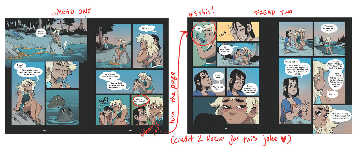
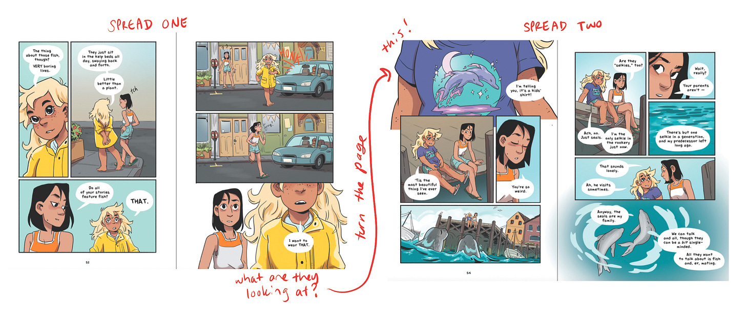
If I am continuing a scene from one spread to the next, I like to end spread 1 in a way that makes the reader want to turn to spread 2 right away. Here’s a few ways to do this, although there are SO MANY OPTIONS:
Pose a question at the end of spread 1/answer the question on spread 2:
The character reacts to something unseen at the end of spread 1/show what they’re reacting to on spread 2:
You can also end a page spread with a reveal, or start a page spread with a reaction or change of heart.
Don’t feel like you have to build a cliffhanger into EVERY SINGLE PAGE TURN, but give consideration to how (and with what) you start and end your spreads. It affects the way your comic will be read!
Finally, if you have a big visual reveal, remember that as soon as the reader turns the page they WILL see it. The tension must be built on spread 1, if you’re going to show the reveal on spread 2. This doesn’t necessarily mean it needs to be the first panel on spread 2, but consider this when you’re planning that big reveal.
Pacing
Pacing is one of the keys to good, engaging graphic novels. It’s a weird, unique, ephemeral art that I’m very interested in—I hope this following section makes sense! Again, a lot of my thinking on this was influenced by Scott McCloud’s Understanding Comics.
To understand comic pacing, we have to look at other mediums:
Illustration is static. You look at a single image and absorb it with a glance. You can look at it quickly or for a long time. It’s nonlinear; you will absorb more information as you look at it, but not necessarily in the order the artist wanted you to. And there is not a temporal element; an illustration captures a single moment. (This comes with a ton of exceptions, but bear with me.)
Prose is temporal. You are reading word-by-word. The story goes by as quickly or slowly as you choose to read it, and it moves in a linear direction—although you can go back and forward as you like. It has no visual element; there is no narrative information outside of the words on the page.
Film/TV is temporal, and has a visual element. The story is happening to you. It goes by in a linear fashion, at the exact speed that the creator intended. You look at images for as long as the creator intended; no more and no less. You receive narrative information from a bunch of sources: the dialogue, the visuals, the music, the editing.
Comics are a combination of all three. Like illustration, you look at the entire page spread and get an idea of the contents; if there’s something really dramatic happening in the bottom right corner, the reader’s eye will probably go right to it. But like prose, to you read it in a linear fashion, panel-by-panel, to understand the story. You also choose the speed with which you read the story. But like film, it’s a visual medium, and there are many ways to provide narrative information.
How does this apply to pacing? When laying out your page, think about illustration, and how it represents a moment in time. An individual panel also represents a moment in time. How quickly or slowly the reader ‘reads’ the panel is up to how much detail/narrative information you put in the panel. A simple panel is absorbed in the time it would take to read a single word; but a complex, detailed illustration will make the reader to linger as they decipher it. You can’t guarantee that your readers will take the time to ‘read’ the image…unless you specifically guide them through it, using tools like composition, direction, etc.
Text is temporal. It CANNOT be absorbed in a glance; a reader NEEDS to take time to read the words. So when we add text to images, we are adding time itself! You CAN put a whole conversation in a single panel, but then you’re just reading a wall of text and that’s boring. It always works best when you use these tools together. Here’s an example of how to apply this thinking to a comic page:
A “silent” panel has just as much power as a panel with text. Use them for reactions, for details, or for pauses in the conversation.
Composition
I’m not going to talk about the general concept of composition because it’s a massive topic…but here are some ways to apply it to a comic spread.
A page is both a static image, and a collection of temporal moments. How can you immerse the reader? A trick I love to do is to use the gutters: the space in between the panels. For night-time scenes, I’ll have the gutters be all black to indicate that there’s darkness. It’s a quick way to orient the reader:
Also it looks cool when it’s printed and you can literally see the night scenes on the side of the pages:
I also love to incorporate one big, open panel that bleeds across both pages, forming the background for the other panels. This is like a ‘setting’ panel; it’s usually a timeless moment, a place where the viewer is meant to linger, while the panels on top of it are specific moments.
In the example below, the big, dramatic kiss panel is the last panel on the page, but it extends all the way to the start of the spread because it is a drawn out, magical moment that shapes the moments before it.
A lineless panel can add a feeling of time passing to the story. Other times, it can be a way to show an action breaking out of the panels. Experiment with lineless panels and open panels and figure out what works for you!
You can have panels that have very little art in them. That adds a sense of breath and space—something that you find a lot in manga and manga-influenced comics. These panels indicate time passing, without needing to clutter the page.
The size of the figures is something to consider too. I try to have a clear difference between character sizes from panel to panel; either they are the same size, or the “camera” is notably closer or farther away. Have a mix of full figures, close-up shots of faces/hands/body acting, and mid-shots. This adds visual interest and prevents confusion.
Here’s an example (I colored in the heads so you can see how the size changes): Since the action of this page is Morgan and Keltie sharing a romantic moment—and almost kissing—I have the heads get bigger and bigger as the moment gets more intimate (almost like a camera zooming in)…until Morgan pulls back, returning to the size she was before.
Of course, there are a lot of comics that achieve interesting effects by keeping characters the same size. My point (always) is not that this is a rule but that it is a choice! Choices are tools, and so they’re worth thinking about.
That’s all for now because I’m out of space. Do you have any questions specifically about page layout? Let me know in the comments and I’ll answer them next week!







Wonderful! Congrats on such an excellent explanation and such good work! I'm a comic artist, too, and now also on Substack, but on an -entry-level- :) ...
So nice to come across all this. I'm just getting back into writing and illustrating after a really long gap ( animation career ). This page and Victoria Ying's blog on process are fantastic . Thank you !!